Alright, so introductions are in order. This is a new blog created for my Meteorology class. This blog is a visual and chronological display of our assignments, and my personal contributions to the class.


That said, our first assignment involves identifying and explaining five types of maps. The five types of maps are choropleth maps, dot density maps, proportional symbol maps, isopelth maps, and environmental sensitivity index maps. As apart of the assignment we were also asked to find a video and upload a hyperlink to our blog of a "weather event" like a hurricane.
Choropleth Map
Above is an example of a Choropleth Map. This type of map uses shading to represent the deviation of some statistical variable in a geographic location. The map above shows the variation of water usage throughout Russia.
Dot Density Map
Above is an example of a Dot Density Map. This map uses dots to represent an amount of a statistical variable. The more variation within a geographic area means more dots. This map relies on data being scattered across a region to provide a clear image of variance across a geographic location (Australia in this instance).
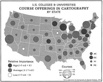
Proportional Symbol Map
The above map is an example of a proportional symbol map. This map like dot density uses dots to represent some statistical variable over a geographic location. Here each region is assigned one dot to represent the statistical variable being measured. The dot varies in size based on the variability of the data, so the larger dots have more of our variable while the smaller dots have less. This map gives less specific geographic data but provides a general comparison over a larger area.
Isopleth Map - Specific Case Topographical Map
A topographic map is a type of isopleth map. An isopleth map uses contour lines to represent variation within an area. A topographic map is a specific isopleth showing elevations rising from sea level representing different elevations of geographic locations.
Environmental Sensitivity Index Map
The map displayed above here is known as an Environmental Sensitivity Index Map or an ESI. This map conveys three types of data as opposed to one in a geographic location. These maps look much more complex then the prior maps because the data that they often portray consists of shorelines of geographic locations and the biological resources and human resources in those geographical locations.
Video Link
The link below is supposed to be a visual from satellites of Hurricane Issac.
Satellite View Issac
Video Link
The link below is supposed to be a visual from satellites of Hurricane Issac.
Satellite View Issac